
“Responsive” is the new word going around the web design campfire. It was first coined by the web design blog “A List Apart” and has become the term being batted around the meeting table every Monday morning.
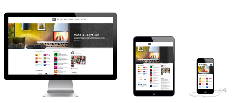
OK, but what does responsive web design mean? For a web design to be responsive, that means that it must respond to how it is viewed. In other words, it should serve different content or styling depending on if a visitor is using a mobile phone, a tablet, a laptop, or a full-screen desktop to view it. And these days, you have to throw in people browsing on anything from a gaming console to an Arduino-powered wristwatch.
A side-order of other buzzwords: “Multi-device layout patterns” – the template for a responsive website. “Dynamic CSS” – Cascading Style Sheets that warp to fit whatever screensize you view it on. “Viewport” – the screen space you have available. And you’re likely to see “responsive web design” abbreviated as “RWD.”
Really, we’ve been over this before. When CSS2 came out, designers were talking up “fluid” and “liquid” layouts, and this is almost exactly the same thing. Instead of hard-coding your website’s width to a specified range, have it flex and flow into whatever container its poured into. To test your page’s layout, get on a full-screen computer (laptop or desktop PC) and view your site in full-screen. Then grab the lower-right corner and scale the web browser to different sizes. If you have the amazing rubber-stretchy website, then you’re already there. If your page clusters together in a mess of overlapping image blocks and becomes impossible to read, then you have work to do with your responsive web design.
Another method for testing your responsive web design is to use various online phone emulators. You should be able to find a few through some scientific Googling. View your page in different phone browsers. Be sure to check that you can still navigate easily – if the link to your ecommerce shopping cart app is impossible to see, that might be what’s hurting your sales!
If you have to fix something, you might need to get a design firm and tell them what the problem is. Be sure to specify which device broke your website. You might also think of reducing clutter. Leave out some of the superfluous graphics, for instance, or stick with plain text menus in your responsive web design instead of the fancy Flash menu.