
“Responsive” is the new word going around the web design campfire. It was first coined by the web design blog “A List Apart” and has become the term being batted around the meeting table every Monday morning.
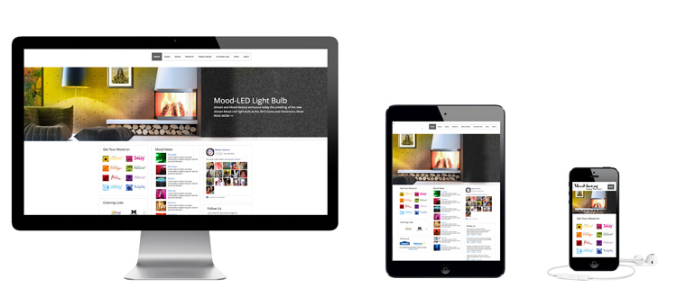
OK, but what does responsive web design mean? For a web design to be responsive, that means that it must respond to how it is viewed. In other words, it should serve different content or styling depending on if a visitor is using a mobile phone, a tablet, a laptop, or a full-screen desktop to view it. And these days, you have to throw in people browsing on anything from a gaming console to an Arduino-powered wristwatch.
A side-order of other buzzwords: “Multi-device layout patterns” – the template for a responsive website. “Dynamic CSS” – Cascading Style Sheets that warp to fit whatever screensize you view it on. “Viewport” – the screen space you have available. And you’re likely to see “responsive web design” abbreviated as “RWD.”